/Passion project. UX Research, Web Design. 3 Days.
/Passion project. UX Research, Web Design. 3 Days.
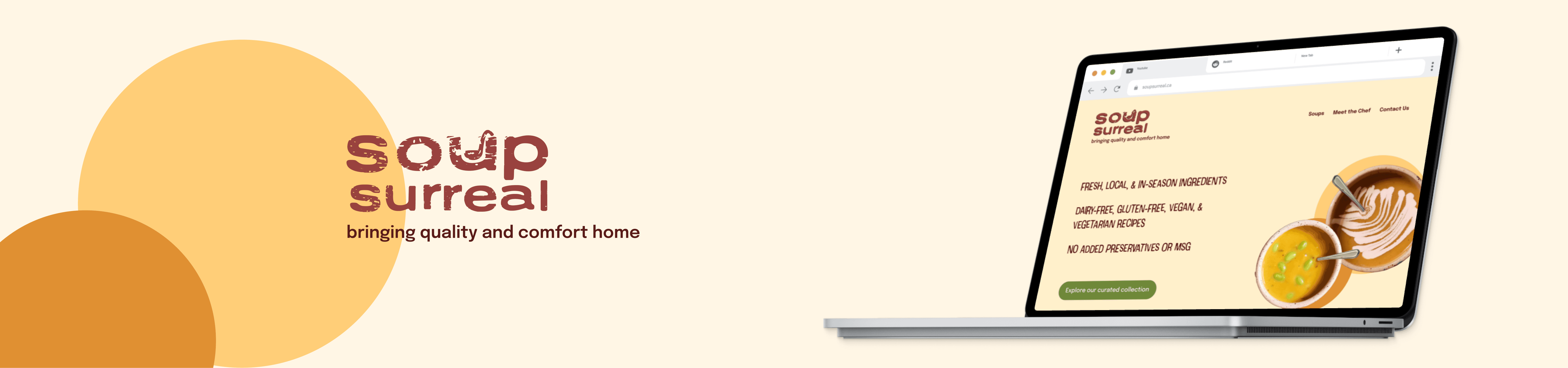
Soup Surreal. a redesign of Stratford's favourite soup joint.
Soup Surreal. a redesign of Stratford's favourite soup joint.
/the current issues
The Dot Com boom reached every corner of the globe and soon followed by UX/UI design… it just didn't reach Soup Surreal.
The Dot Com boom reached every corner of the globe and soon followed by UX/UI design… it just didn't reach Soup Surreal.
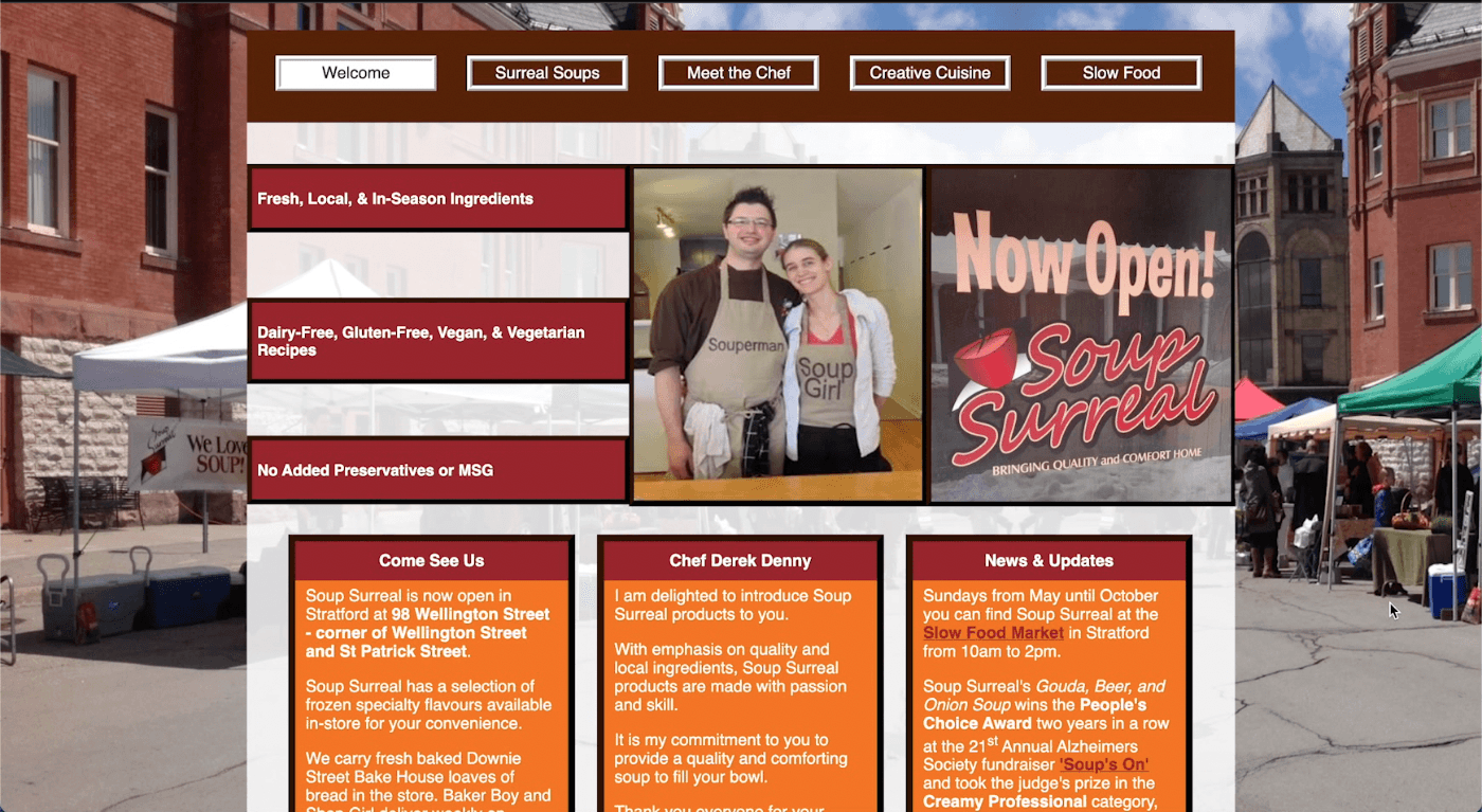
Soup Surreal has very high quality products, but not a high quality site to present them. Design wise, it was minimal without the aesthetic, like some sites you would see in the 1990’s when the internet just became a vendor for businesses worldwide.
Soup Surreal has very high quality products, but not a high quality site to present them. Design wise, it was minimal without the aesthetic, like some sites you would see in the 1990’s when the internet just became a vendor for businesses worldwide.
Information breakdown
The information architecture was simply not there, especially through visual typography. Menu items were all on the same level without an ability to drill down, so users were met with information overload. Content on pages had no hierarchy, giving nothing to guide the user through a story. Yes, this homepage may be arranged in a natural z-pattern for Western users to digest content in a familiar way, but it lacks typographic hierarchy.
The information architecture was simply not there, especially through visual typography. Menu items were all on the same level without an ability to drill down, so users were met with information overload. Content on pages had no hierarchy, giving nothing to guide the user through a story. Yes, this homepage may be arranged in a natural z-pattern for Western users to digest content in a familiar way, but it lacks typographic hierarchy.
What's on the menu?
Usually people come to a website to see what's available in-store that day when delivery is not available. Soup Surreal in this current state does not reflect that very well - you have to go to their Facebook page to view availability. Users are met with a "Soups" menu and a "Creative Cuisine" page, without any indicators to how they're different. Only on the front page do users find out that the store sells frozen soups, no mention of a hot ready-to-go soup menu available.
Usually people come to a website to see what's available in-store that day when delivery is not available. Soup Surreal in this current state does not reflect that very well - you have to go to their Facebook page to view availability. Users are met with a "Soups" menu and a "Creative Cuisine" page, without any indicators to how they're different. Only on the front page do users find out that the store sells frozen soups, no mention of a hot ready-to-go soup menu available.
Overall thoughts
Overall thoughts
The user interface leaves much to be desired. Pages are heavy with text, delivering information overload and a lack of skimmability. Soup menu's don't indicate on-demand flavour availability that change every day. Potential customers, even from Stratford itself, have no incentive to keep coming back to check menu items that don’t even accurately reflect what’s available in store.
The user interface leaves much to be desired. Pages are heavy with text, delivering information overload and a lack of skimmability. Soup menu's don't indicate on-demand flavour availability that change every day. Potential customers, even from Stratford itself, have no incentive to keep coming back to check menu items that don’t even accurately reflect what’s available in store.
/a much needed revamp
An all-new modern site that boosts online identity, effectively showcasing Soup Surreal's commitment to fresh, community-oriented dining.
An all-new modern site that boosts online identity, effectively showcasing Soup Surreal's commitment to fresh, community-oriented dining.
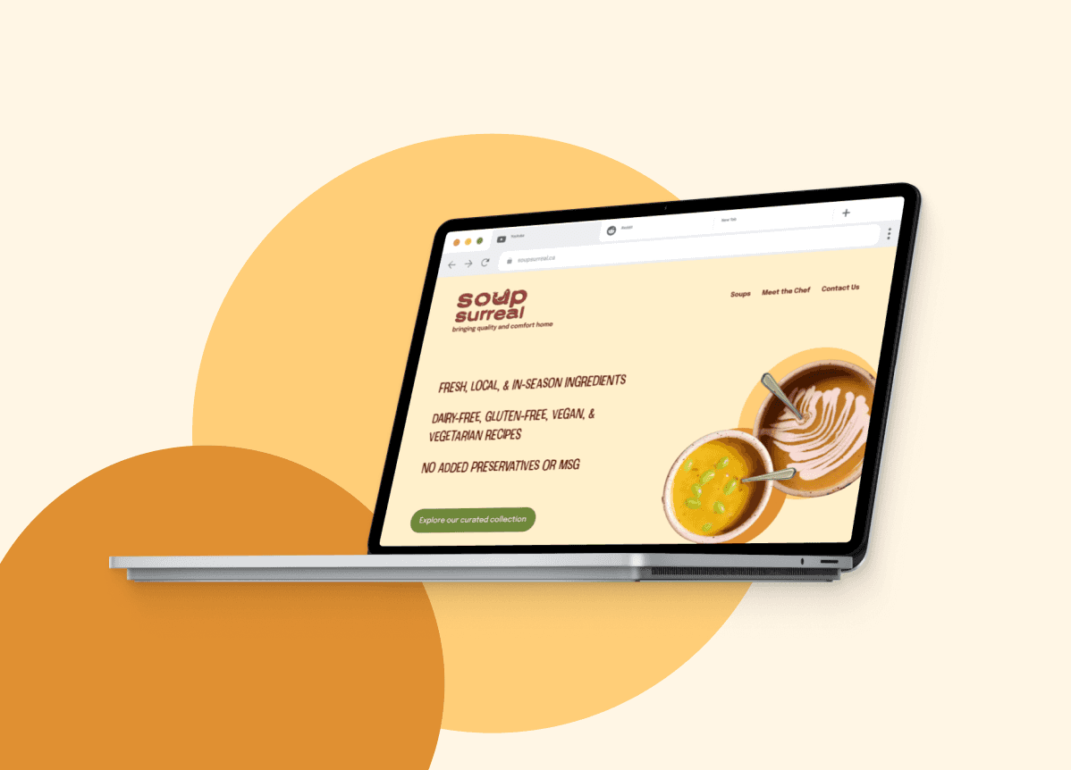
The redesign focused on decluttering the layout, adopting a more cohesive color palette that aligns with the brand, and reorganizing content to ensure the restaurant's values and offerings are front and center, improving overall readability and navigation clarity.
Introducing a "soups of the day" feature directly on the main page addressed the dynamic nature of the menu, streamlining the user journey from website visit to in person dining.


/the process
Evaluating the Issues
Evaluating the Issues
The original design of Soup Surreal's website struggled with professionalism and coherence, leading to a cramped and overwhelming user experience. Squished content with little whitespace disrupted the visual flow. The inconsistent use of vibrant colors and backgrounds across pages created a fragmented user experience.
The original design of Soup Surreal's website struggled with professionalism and coherence, leading to a cramped and overwhelming user experience. Squished content with little whitespace disrupted the visual flow. The inconsistent use of vibrant colors and backgrounds across pages created a fragmented user experience.
Additionally, the website didn't clearly showcase the restaurant's focus on fresh, local ingredients, with an overly bright orange color scheme that was visually overwhelming. The redesign simplified the layout, introduced a harmonious color scheme matching the brand, and rearranged content to emphasize the restaurant's values, enhancing readability and navigation.
Additionally, the website didn't clearly showcase the restaurant's focus on fresh, local ingredients, with an overly bright orange color scheme that was visually overwhelming. The redesign simplified the layout, introduced a harmonious color scheme matching the brand, and rearranged content to emphasize the restaurant's values, enhancing readability and navigation.
Research and Inspiration
Research and Inspiration
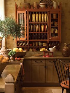
The journey began with diving deep into the essence of Soup Surreal, capturing the warmth and authenticity with the "word from Chef Danny" section and the physical vibe of the location itself. Inspiration sites like Pinterest were also used to gain a better view of the aesthetic, laying the groundwork for a redesign that feels as welcoming as the restaurant itself.
The journey began with diving deep into the essence of Soup Surreal, capturing the warmth and authenticity with the "word from Chef Danny" section and the physical vibe of the location itself. Inspiration sites like Pinterest were also used to gain a better view of the aesthetic, laying the groundwork for a redesign that feels as welcoming as the restaurant itself.


Information Heirarchy
Information Heirarchy
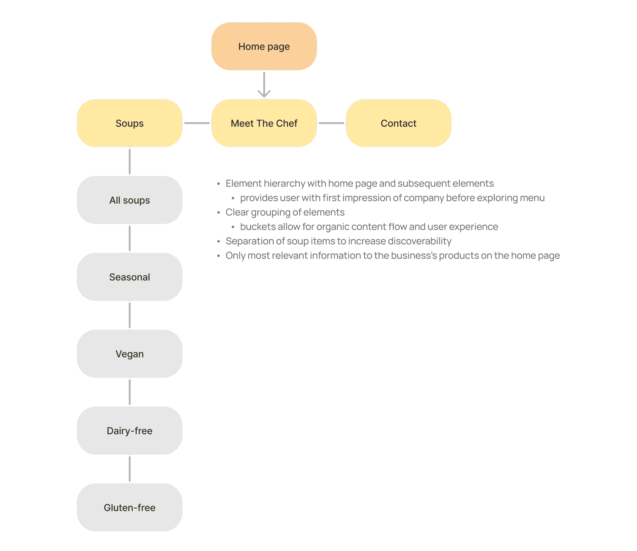
The home page now serves as a hearty welcome mat, showcasing the day's soup flavors and customer testimonials front and center, all while ensuring the chef's personal touch and the local sourcing ethos shine through.
The menu could now be filtered by various dietary restrictions to improve accessibility. Although this site map does not differ much from the hierarchy of the original, it makes sure that not everything is on one level and opens up possibilities to categorize content more effectively.
Sketching & Wireframing
Sketching & Wireframing
A clear sitemap was the first step, carving out a structure that lets the content breathe and make information readily discoverable. Wireframes came next, crafted in Figma, shaping a skeleton that prioritizes ease and clarity in user navigation. As I did not have the ability to reach out and interview the store owners about their wants and needs, I stuck to the content they originally had on their site. I had to infer about a lot of the design and content choices, choosing to highlight a mission statement that was clear in their site.
A clear sitemap was the first step, carving out a structure that lets the content breathe and make information readily discoverable. Wireframes came next, crafted in Figma, shaping a skeleton that prioritizes ease and clarity in user navigation. As I did not have the ability to reach out and interview the store owners about their wants and needs, I stuck to the content they originally had on their site. I had to infer about a lot of the design and content choices, choosing to highlight a mission statement that was clear in their site.
Keep in mind…
Keep in mind…
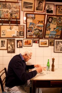
In this design, it was important to understand the nuances of a small business—that meant no delivery like many other restaurants. Soup Surreal wants to build community through face-to-face interactions, not through anonymity.
In this design, it was important to understand the nuances of a small business—that meant no delivery like many other restaurants. Soup Surreal wants to build community through face-to-face interactions, not through anonymity.

Visual Design
Visual Design
The redesign embraces the warmth of soup with a desaturated orange and red palette, ensuring comfort at every glance. The playful header font and accessible body text invite users into a space that feels like home, with improved contrast for a seamless reading experience.
The redesign embraces the warmth of soup with a desaturated orange and red palette, ensuring comfort at every glance. The playful header font and accessible body text invite users into a space that feels like home, with improved contrast for a seamless reading experience.

/the value of user-centred design
Restaurant doesn't always mean online ordering
Restaurant doesn't always mean online ordering
Balancing the digital presence of a business that thrives on in-person connections posed a unique challenge, especially without incorporating online ordering. Soup Surreal is family owned and run in a small town, one that doesn't necessarily cater to the standard needs of on-demand ordering and delivery.
Balancing the digital presence of a business that thrives on in-person connections posed a unique challenge, especially without incorporating online ordering. Soup Surreal is family owned and run in a small town, one that doesn't necessarily cater to the standard needs of on-demand ordering and delivery.
The project served as a practical application of design principles, guiding the redesign to stay true to the restaurant's mission and avoid unnecessary frills. At the end of the day, design principles promote user-centricity. A UX designer must understand what's best for the company, not just the most popular market trends.
The project served as a practical application of design principles, guiding the redesign to stay true to the restaurant's mission and avoid unnecessary frills. At the end of the day, design principles promote user-centricity. A UX designer must understand what's best for the company, not just the most popular market trends.